FOP Front-of-Pack Nutrition Symbol Checklist + FAQ
FOP Guide: Checklist, Symbol Downloads, and Tips for Canadian Food & Beverage Brands.
What is FOP front-of-pack symbol, Where can I download the FOP Symbols, we've got you covered!
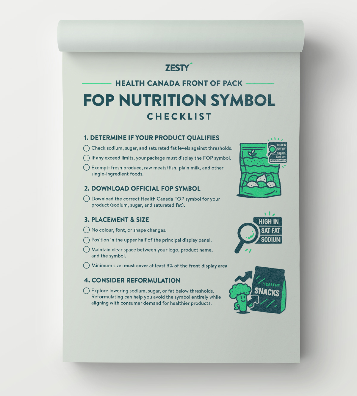
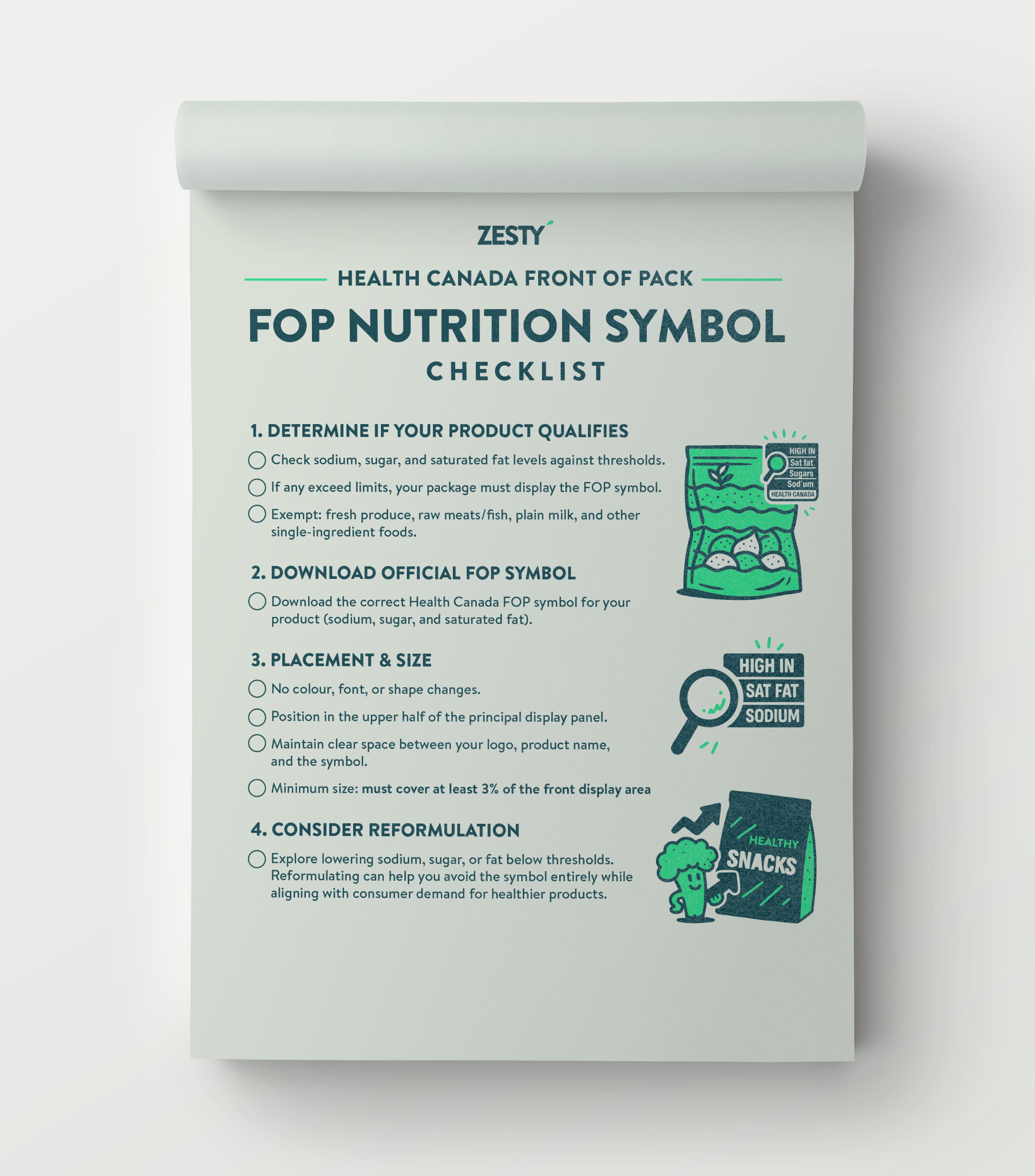
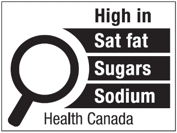
In 2026, Health Canada’s Front-of-Pack (FOP) Nutrition Warning Labels will become mandatory on most pre-packaged food and beverage products. This marks one of the biggest packaging design and compliance shifts for Canadian food brands in decades. The new black-and-white magnifying-glass symbols will highlight products high in sodium, sugars, or saturated fat — helping consumers make quick, informed choices at a glance.
We understand how tricky Canadian packaging design regulations can be. Our work with food and beverage brands has taught us the ins and outs of CFIA and Health Canada labelling, and we’ve put this guide together to make your process a little easier.
Frequently Asked Questions
What are Front-of-Pack (FOP) warning labels?
FOP labels are small black-and-white symbols. The symbols are applied to pre-packaged foods in Canada that are high in sodium, sugars, or saturated fat. The FOP symbols are meant to help consumers make quick, informed decisions about nutritional content.
When do FOP labels become mandatory in Canada?
The CFIA will begin enforcing Front-of-Pack warning label regulations on January 1, 2026. Food manufacturers must ensure all qualifying products display the new FOP symbol by that date.
Which products require FOP labels?
Most prepackaged foods will need an FOP label if they exceed specific thresholds for sodium, sugars, or saturated fat. Some products are exempt — like fresh fruit and vegetables, raw meats, and milk — but most processed or prepared foods will be affected.
What do the FOP symbols look like?
They’re standardized black-and-white icons shaped like a magnifying glass containing the text:
“High in…” followed by saturated fat, sodium, and/or sugars. They must appear in both English and French on the principal display panel.
How should food and beverage brands prepare?
Start now. Review recipes, assess nutrition facts panels, and adjust formulations where possible. Then, integrate the new FOP symbol early in your design process so it works with — not against — your branding.
Does the FOP label have to be bilingual?
Yes. The required text (e.g., “High in sodium / Élevé en sodium”) must appear in both English and French, consistent with all CFIA bilingual labelling requirements.
Can the FOP label be customized or coloured?
No. The FOP icon’s design, colour (black-and-white), shape, and font are standardized by Health Canada. Brands can’t alter or stylize it — but creative layout and visual hierarchy can minimize visual disruption.
Will these labels hurt sales?
Not necessarily. Studies show that brands that embrace transparency and improve formulations often see stronger consumer trust and loyalty. Good design and clear communication can offset negative reactions. Additionally, it will be a universal symbol so your competition needs to have it as well.
While some brands worry about the impact, this change can actually be an opportunity to out-maneuver competitors. By reformulating to reduce sodium, sugar, or fat, you not only avoid the warning label — you also align with growing consumer demand for healthier products.
Where can I Download the FOP Symbols?
You can download FOP Symbols ZIP