Hotfingers
Hotfingers heritage ski glove rebranding
Channelling vintage ski vibes while reigniting the brand and glove package design
Services
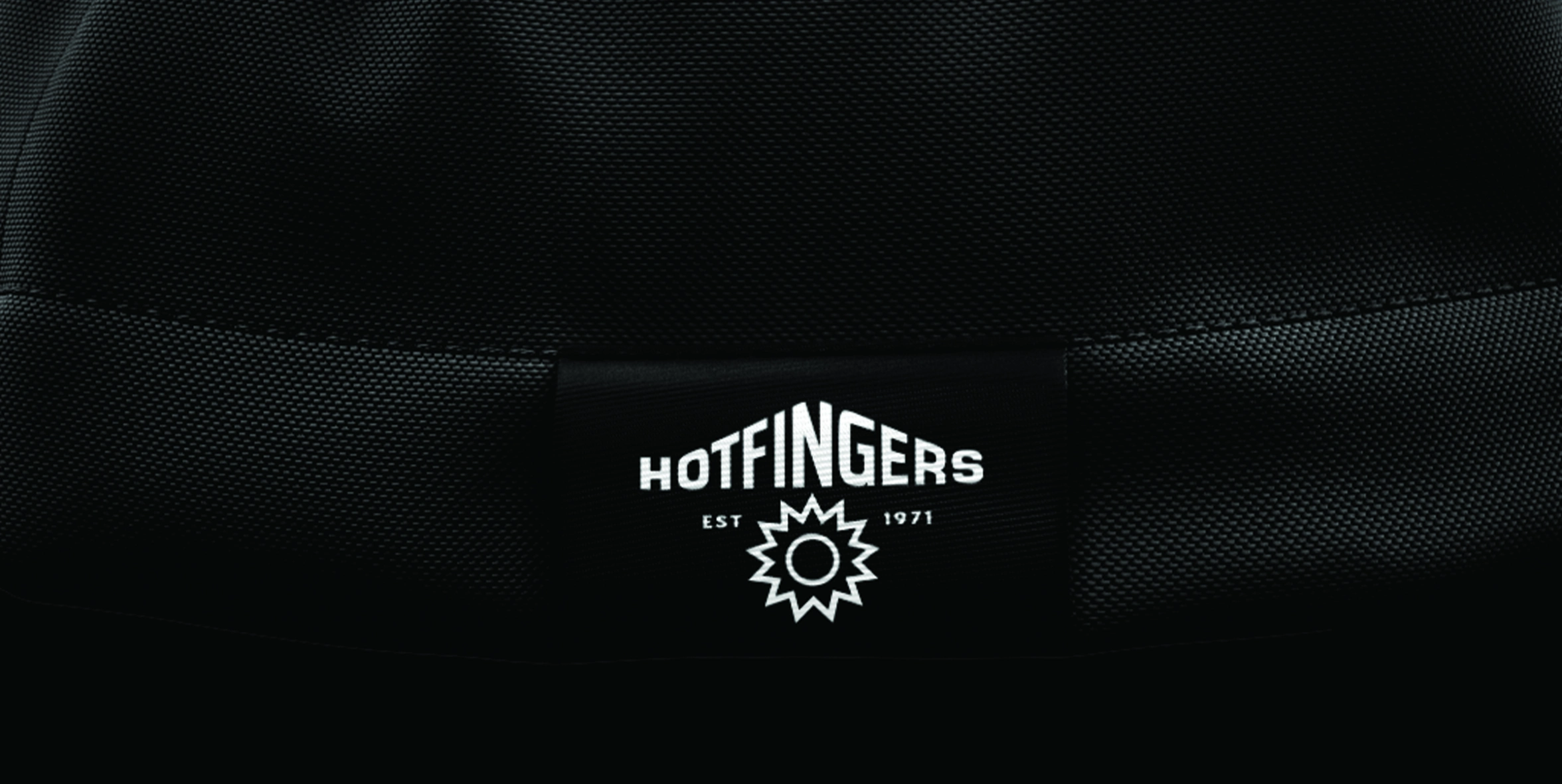
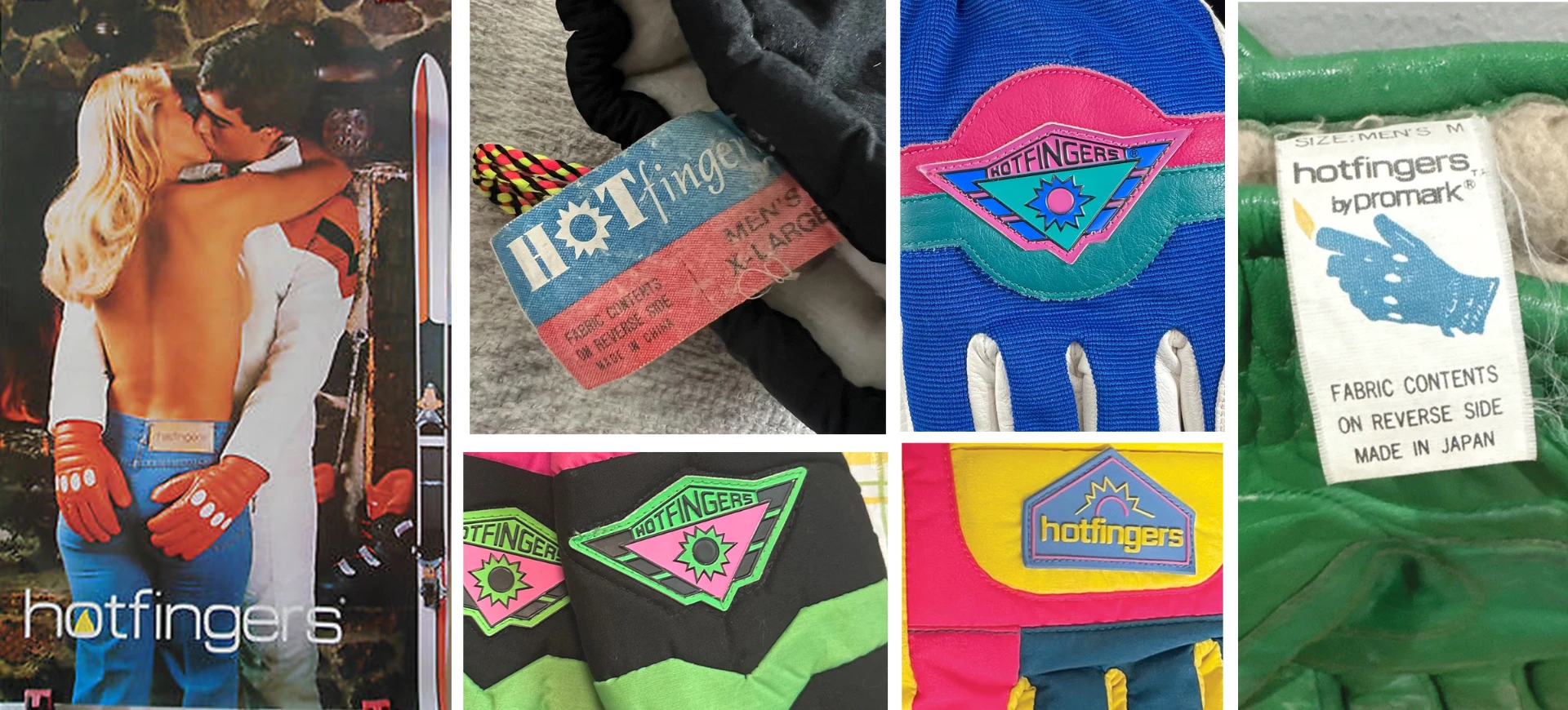
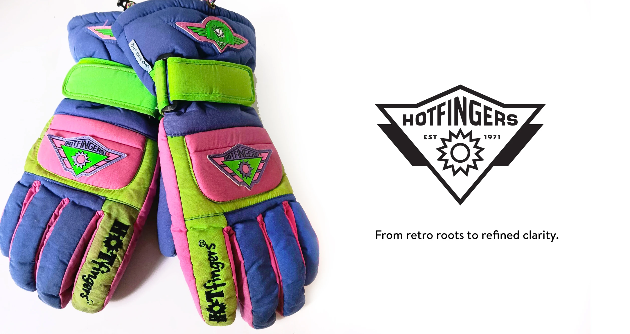
We went back to the roots — studying the original Hotfingers gloves, logo and brand identity from the ’70s and ’80s. Back then, the brand had a bold, confident personality: bright colours, geometric energy, and that punchy, no-nonsense attitude that defined the era. The new identity channels that vintage vibe, modernized for today’s outdoor customer.
Branding
The Hofingers rebrand reignites its energy with a versatile, hardworking identity system that’s as practical as the product itself. A bold, modern badge inspired by vintage ski graphics, a strong geometric wordmark, and a flexible design kit bring new life to the brand across gloves, hangtags, and packaging.
Vibrant retro-inspired accents, grounded in timeless black and white, balance nostalgia with everyday utility—topped off with a confident voice and tagline: “Staying Hot Since ’71.”

