Raw Truth
Getting to the meat of this brands purpose
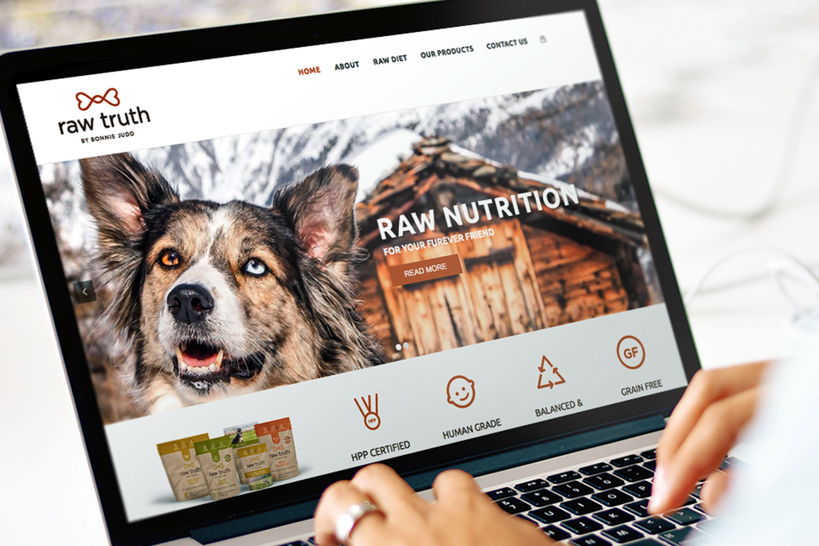
Dog food package design that keeps things raw; allowing the brand's honest side to shine through.
Services
Brand Naming
When developing a brand name for this dog food, we narrowed in on the passion and commitment to honest raw ingredients. It was important that we captured the brand founders huge heart and uncompromising values.
The Raw Truth projects a sense of clarity, honesty and truth.
Branding
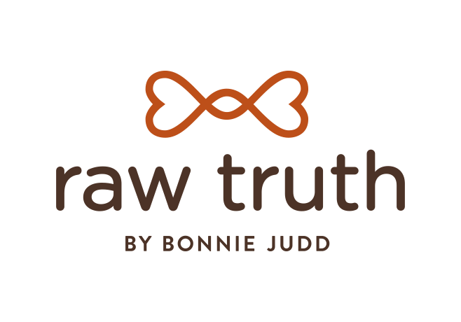
The dog bone logo forming two hearts and an infinity symbol—reinforcing the brand’s love for pets and desire to continually create the best possible nourishment for them. It also represents the hope of longer-living “infinite” health of our beloved pets.
A Raw Approach to Pet Food Package Design
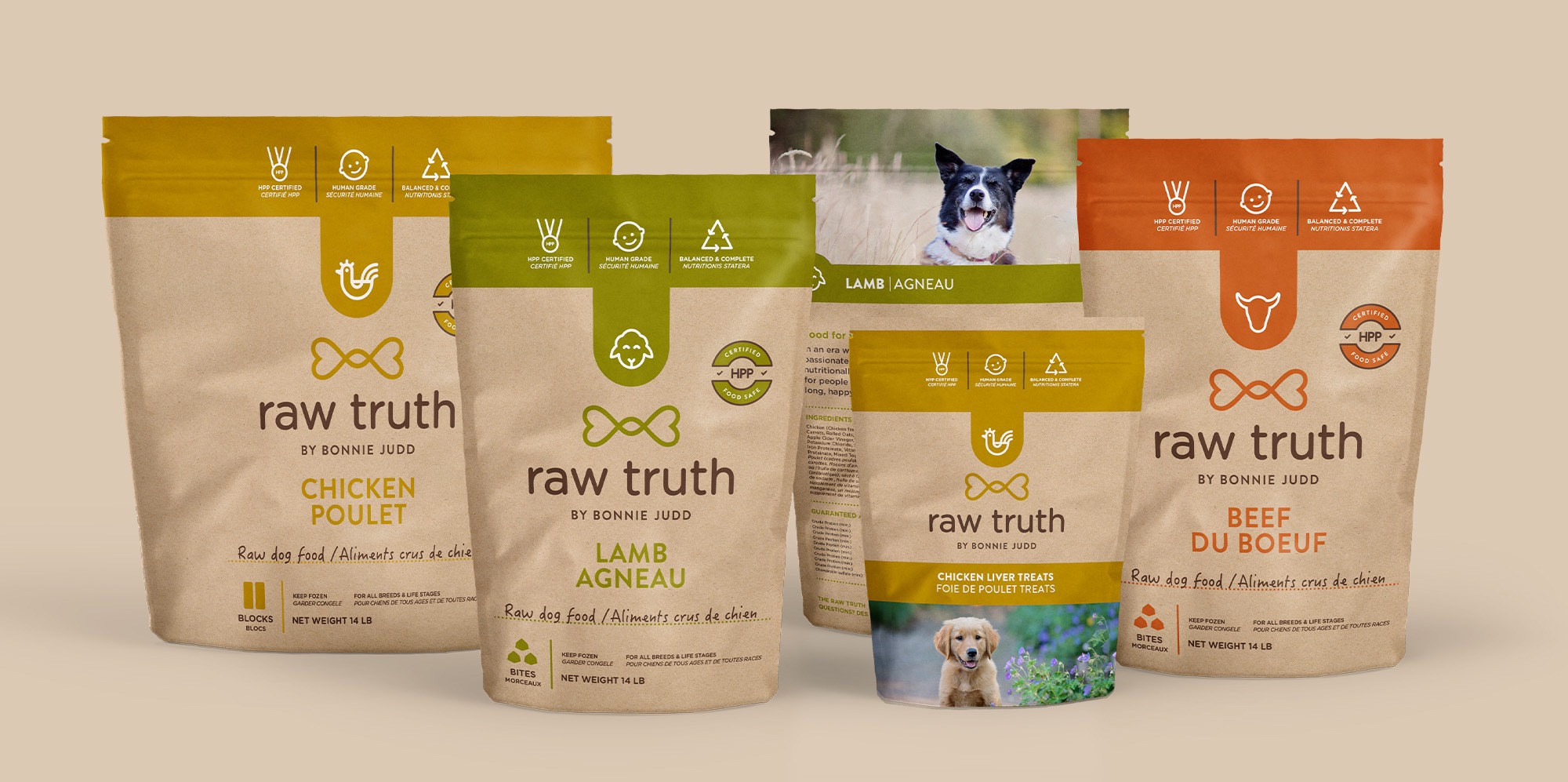
The package design for the dog food, we followed this raw, natural message—using kraft paper pouches, warm earth-tone colours and heart-warming photography of dogs in their element. The purest form of paper that’s both durable and had the perfect aesthetic we were searching for, the brown pigment works to create a cohesive look and intensify the simplistic designs.
Typography, adorable icons, and wholesome photography, really brings this pet food brand to life.

