SETA
Superfood smoothies & functional beverages
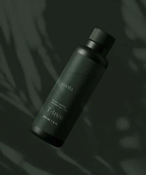
Package design that brings simplicity, purity, and vitality to plant-based beverages
Services


Package Design that Connects You With Nature
The goal was to reposition SETA as a standout in the functional wellness space with modern, joyful, and shelf-impactful packaging—while staying grounded in the brand’s core values of nature, transparency, and conscious living. The refreshed logo and package design celebrates SETA’s connection to nature while introducing bold, vibrant imagery that commands attention and communicates clearly. SETA is positioned as a modern leader in plant-based wellness—offering convenient, consciously sourced superfoods.
Packaging System for scaleable multi-SKU lineup
Our goal was to build a scaleable multi-SKU packaging system that gives SETA stronger shelf visibility and instant flavour differentiation across Smoothies, Matcha RTD, and functional Latte mixes.
We developed a unified packaging design system that brings clarity, consistency, and shelf impact across multiple formats. Each category was given a distinct yet cohesive visual language, using intentional colour blocking, ingredient-forward illustrations, and minimalist typography to support quick recognition in retail environments.
The system allows SETA to scale seamlessly as new flavours and formats are introduced, while maintaining a strong, modern identity rooted in wellness and everyday vitality. This holistic approach ensures that every SKU—whether a powdered matcha latte package design or a bottled RTD—feels unmistakably SETA, strengthening brand trust and visibility across both digital and in-store touchpoints.