Slow Bottled Sunday
From outcast fruits to main squeeze!
Branding that celebrates sustainability & connection through quirky illustrations, a fresh logo design, and bold package designs.
Services
Branding
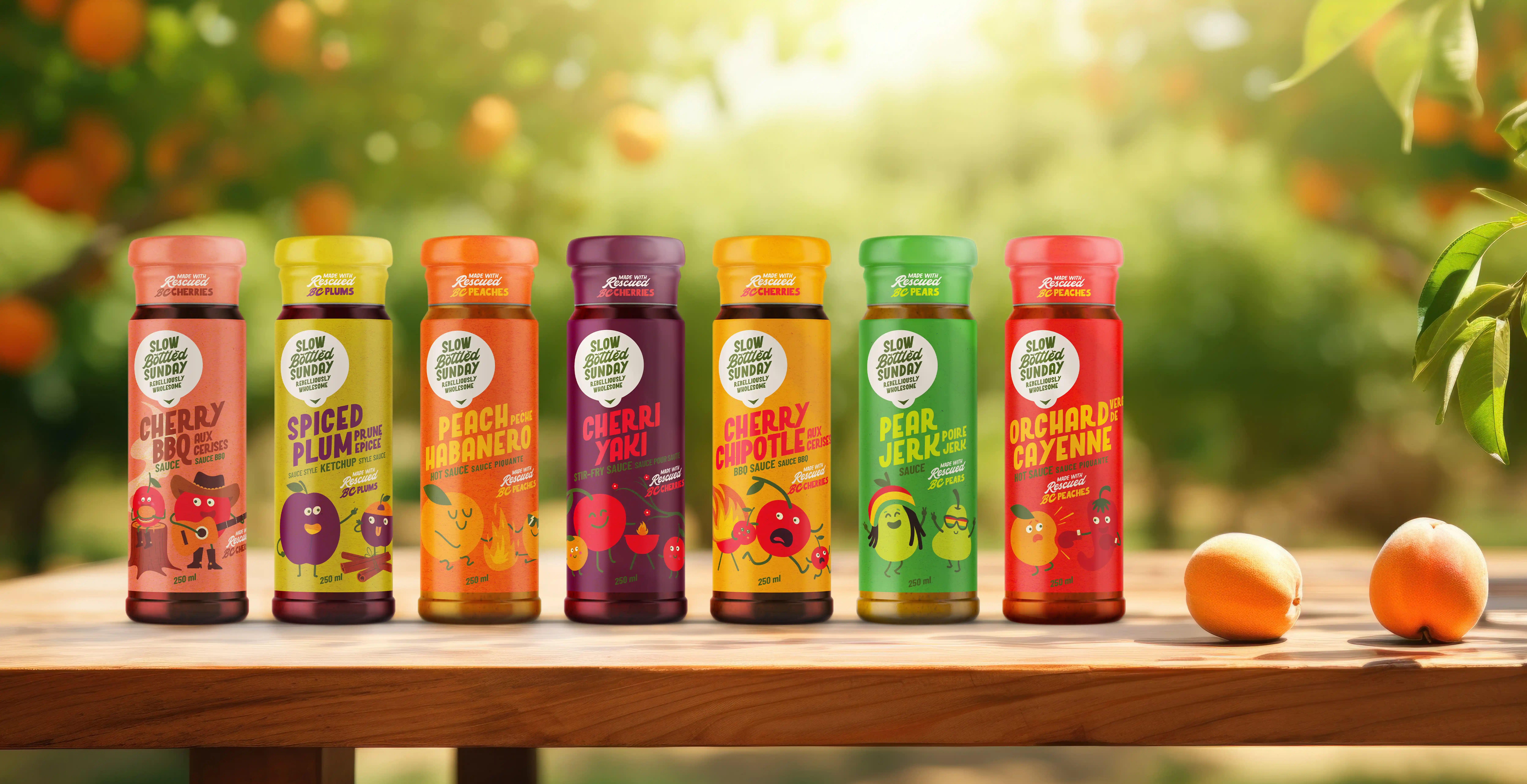
The brand refresh features a custom typeface for the logo, with natural lines and imperfect shapes, echoing the forms of rescued fruit and evoking warmth and authenticity. A nod to the original logo is preserved through a slanted layout, while the integration of a fruit stem and leaf into the letterforms highlights the brand’s dedication to real, fruit-based products. Green colour reinforces the connection to orchards and natural ingredients, creating a softer, more approachable palette.
Package Design
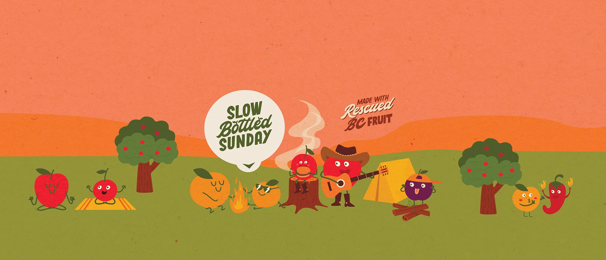
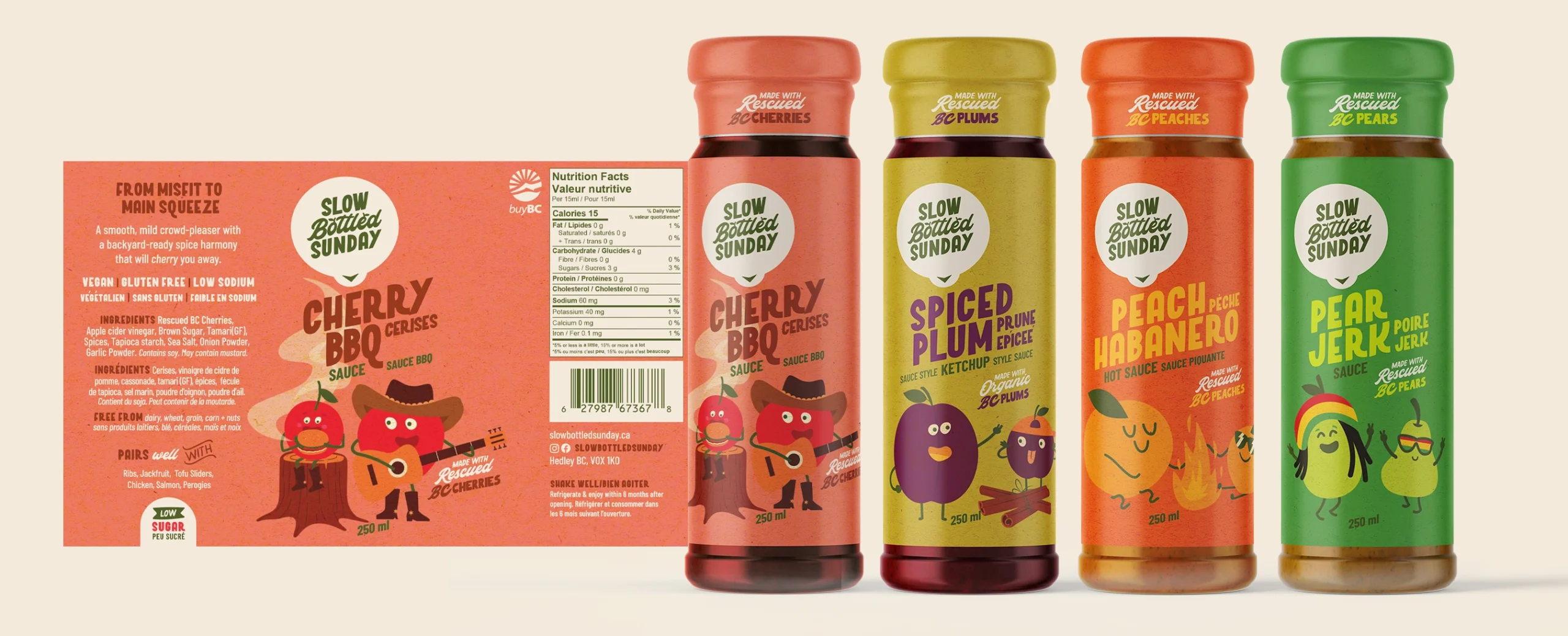
Package Design for Slow Bottled Sunday brings fruit to life through playful fruit characters that embody the brand’s fun, cheeky personality while emphasizing human connection, family, and friendship. By putting fruit front and centre, these characters highlight the brand’s focus on fruit-first ingredients and invite consumer curiosity.
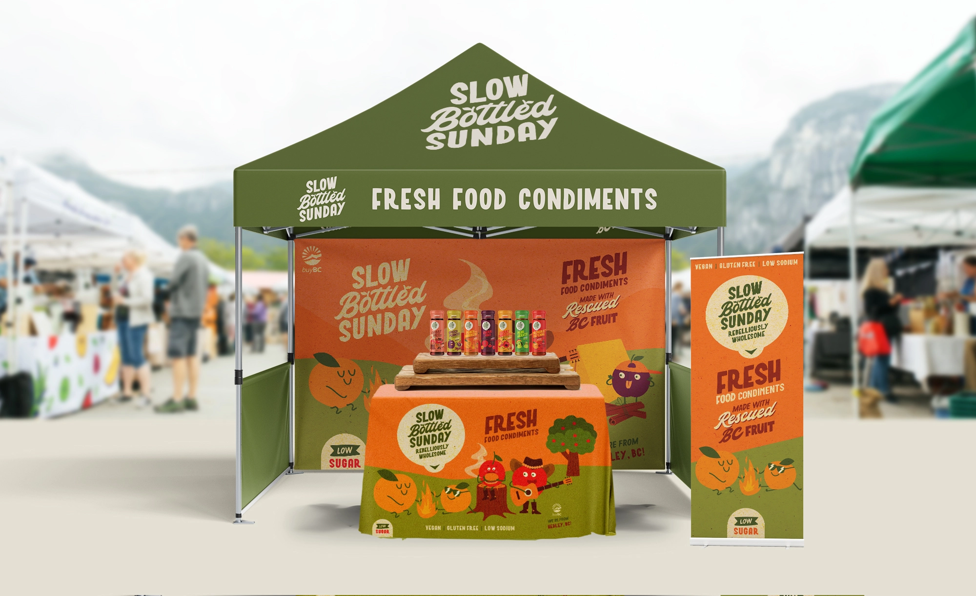
The characters offer marketing versatility, easily adaptable for digital ads, social media, and promotional materials. This approach also taps into the collectability factor, encouraging customers to purchase different varieties as part of a themed series. The logo, cleverly designed to resemble a fruit sticker, reinforces the brand’s commitment to freshness and natural ingredients, doubling as a fun promotional giveaway.
Slow Bottled Sunday’s rebrand brought clarity, charm, and cohesion to a growing local favourite. By uniting storytelling, illustration, and packaging into one expressive system, the brand now stands out on shelves, resonates with conscious consumers, and feels ready for wider retail expansion.

