It Looks Like Packaging. It Isn’t Packaging
What are the risks of CPG brands using AI
AI can create polished CPG packaging in seconds—but not strategy, compliance or print-ready files. See where AI packaging design falls apart.
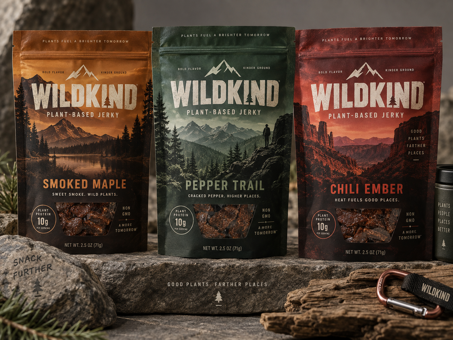
We asked AI to invent five CPG brands. In a few minutes, it created five surprisingly polished looking packaging concepts.
And none of them would survive contact with reality.
AI is getting very good at making things that look finished. That distinction matters. For an experiment, we gave AI five hypothetical CPG products:
- a no-sugar electrolyte mix
- a matcha fruit RTD
- an alcoholic espresso drink
- a protein popcorn
- a vegan jerky line
It came back with five brands: SALTWAKE, Mossy, Waken, POPtein and WILDKIND.
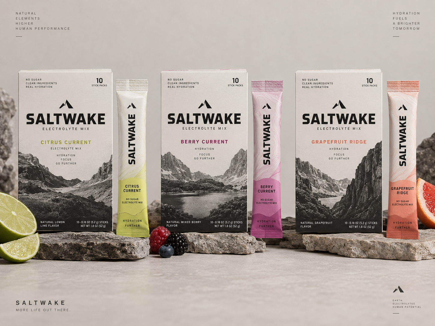
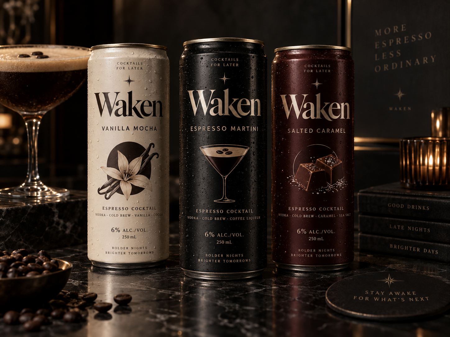
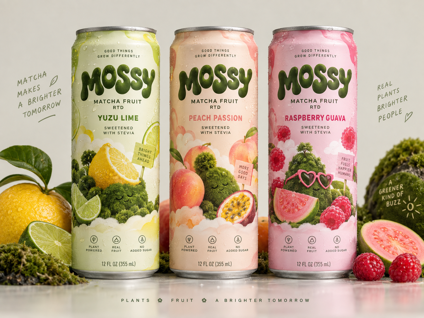
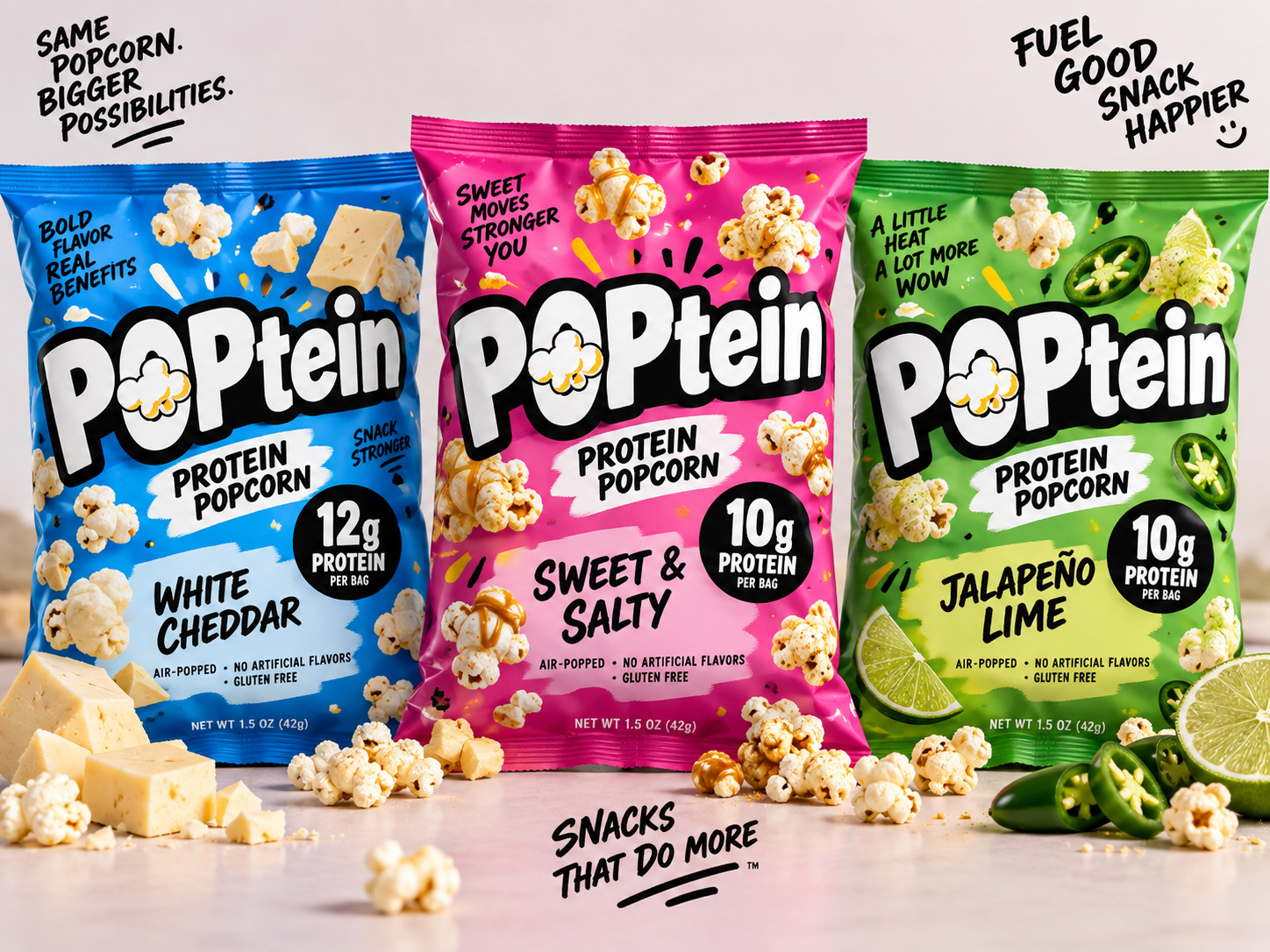
And at first glance? They look pretty good right! SALTWAKE looks clean, athletic and outdoorsy. Mossy is colourful and charming. Waken could comfortably sit behind a cocktail bar. POPtein has that popcorn energy that jumps off the screen. WILDKIND looks ready for somebody’s next backcountry adventure.
Put the mockups into a pitch deck and you could easily imagine a room full of people saying: “Wow. AI did that?”
Yep.
Now try sending one to a printer.
The first problem: these aren’t packages
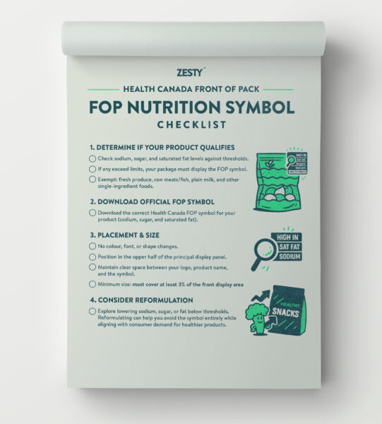
They’re pictures of packages. That sounds obvious, but it’s the part of generative AI that is easiest to misunderstand. A beautiful AI-generated pouch does not contain a pouch design. There is no dieline. No front panel. No back panel. No gusset. No seal area. No bleed. No safe zone. No barcode placement. No Nutrition Facts table. No ingredient list. No legal copy. No Front-of-package (FOP) nutrition symbol. No actual font we can use. No linked imagery. No separations. No spot colours. No white ink layer. No varnish plate. etc.
There may not even be a logo. There is an image containing pixels that look like a logo.
A production designer cannot open the WILDKIND image, move the wordmark 3 mm, change the Chili Ember pouch to a fifth flavour, update a bilingual ingredient declaration and export press-ready artwork. They would first have to rebuild the entire thing.
Which means what AI created was not the finished design. It was a rendering of an idea. That can absolutely be useful. But those are two very different things.
Then look closer at the AI-generated copy
This is where our little experiment became particularly funny. We asked for five deliberately different brands. AI proceeded to write: “Hydration fuels a brighter tomorrow.” Then: “Plants + fruit + a brighter tomorrow.” Then Waken got: “Bolder nights. Brighter tomorrows.” Then WILDKIND: “Plants fuel a brighter tomorrow.”
😂 Five categories. Five audiences. Five brand personalities. Apparently everybody is heading toward the same “brighter tomorrow“. It also started repeating variations on “go further,” “farther places,” “good plants,” “good things,” “fuel,” and the usual constellation of vague modern wellness language. Nobody instructed it to do that. It arrived there because generative
AI is extraordinarily good at identifying the statistical centre of what already exists.
And therein lies the problem.
Great branding is usually trying to do the opposite of being the statistical average. The job is not to determine what a hydration brand generally sounds like. The job of a brand strategist is to determine what this particular hydration brand can own that another one cannot. AKA their “Zest Factor“.
SALTWAKE looks like a hydration brand
And that’s both the compliment and the problem. The mountains are beautiful. The restrained palette feels premium. The topographic lines make sense. The wordmark feels strong. You understand the category immediately. But take away the name and ask yourself: Whose brand is this? Why mountains? Why “go further”? What does SALTWAKE believe? Who is it actually for? What separates it from the enormous pile of performance, outdoor, mineral and electrolyte brands already borrowing imagery from mountains, endurance and human potential?
AI solved the aesthetic equation. Outdoor performance product = mountains + geological texture + condensed sans serif + restrained colour + endurance language. It hasn’t solved the brand.
Mossy may be the most interesting creatively
There’s something genuinely fun about it. The strange little moss creatures, fruit, pastel colour system and big squishy wordmark give the brand personality. It feels younger and less predictable than most matcha packaging.
It’s also a perfect example of where a human creative director still matters. There are about seventeen ideas happening at once!Matcha. Fruit. Moss. Characters. Sustainability. Plants. Happiness. Stevia. “Good things grow differently.” “Real plants brighter people.” “A greener kind of buzz.” “Fruit fuels happier humans.” Which one is the idea?
Great branding is often an exercise in subtraction.
AI loves adding another thing. And another thing. And perhaps a tiny moss hill wearing heart-shaped sunglasses while we’re at it— with 6 legs and one coming out of the creatures head. A designer has to decide what deserves to survive.
Waken knows all the visual codes
Dark marble. Condensation. Gold. Serif typography. Cocktail glass. Coffee beans. Candlelight.
If you asked someone to describe a premium espresso martini brand without showing them one, there’s a good chance you’d end up somewhere around here. Lovely. It also demonstrates another limitation of AI branding: category fluency is not the same thing as originality.
AI is very good at assembling recognizable signals. Luxury looks luxurious. Natural looks natural. Protein looks energetic. Outdoors looks outdoorsy. The harder job is creating a visual language that remains appropriate to the category while giving the brand something genuinely ownable. That requires decisions, not decoration.
Then POPtein quietly invented a product formulation
One flavour has: 12g PROTEIN The others have: 10g PROTEIN Why?
No idea. AI decided. It also added gluten free, no artificial flavours and other product language. This is where cute becomes dangerous. Because packaging copy isn’t lorem ipsum. Claims are claims. “High protein,” “source of fibre,” “no added sugar,” “natural,” “non-GMO,” “gluten free,” ingredient statements, allergen declarations and nutrient claims aren’t decorative badges that get sprinkled onto a package because they look good there.
They need to be true. They need to reflect the actual formulation. And depending on where the product is sold, they need to comply with the regulations governing that product and market. Our fictional brands didn’t have formulations. AI happily gave them claims anyway.
WILDKIND did it too
Our vegan jerky suddenly became: 10g plant protein. Non-GMO.
SALTWAKE acquired “clean ingredients” and specific product attributes. Mossy acquired “no added sugar.” The machine is filling visual space with things it has learned usually appear in that visual space. That is fundamentally different from understanding whether those words are legally, technically or strategically appropriate.
For a concept image, that may be harmless. For packaging headed to market, it is absolutely not.
Packaging has a back
AI mockups have an interesting habit of living permanently on the front panel. Real products are less fortunate. Turn the package around and suddenly the sexy branding project includes: ingredients, allergens, preparation instructions, company information, UPCs, certifications, recycling information, mandatory declarations, Nutrition Facts, net quantity, bilingual requirements, product-specific regulations and whatever else the jurisdiction and category require.
And all of it has to fit. Legibly. On an actual piece of packaging. Sometimes in two languages. Sometimes on a pouch approximately the size of your hand. This is where real packaging design gets interesting. Hierarchy isn’t simply deciding how big the logo should be.
It is creating a system where brand, flavour, product description, regulatory information, benefits and mandatory content can coexist without turning the package into visual soup.
A beautiful front-panel hallucination doesn’t solve that.
Then somebody has to manufacture the thing
This is the profoundly unsexy part AI mockups conveniently skip. What is the substrate? Is it a printed film, shrink sleeve, pressure-sensitive label, carton or direct-print can? How many colours can the printer run? Are we using process CMYK, Pantone inks or both? Does the metallic effect in the render actually require foil? Is that gradient reproducible? What happens where the pouch seals? Where does the zipper land? Does an illustration disappear into a gusset? Will the tiny reversed type plug on press? Does the barcode have enough contrast? What resolution is the imagery? Do we need trapping? Overprint? A spot white plate? What tolerance does the printer require?
Suddenly “make me a cool jerky pouch” has become considerably less magical.
This isn’t bureaucracy around design. This is packaging design. The final object has to survive physics.
And we haven’t even touched the brand system
Suppose Mossy launches with three flavours. Great. What happens when flavour twelve arrives? Can the system stretch? Can consumers identify the brand from six feet away? Can they distinguish Raspberry Guava from Strawberry Hibiscus in half a second?
Can the identity move onto a 12-pack carton? A multipack tray? A website? A retail display? A trade-show booth? An Instagram ad? Does the Waken wordmark still work at 14 mm wide? Does POPtein have typography that actually exists and can be licensed? Can WILDKIND own its visual territory without becoming indistinguishable from every other brand using mountains, pine trees and distressed type? Real identity work is a system. AI usually shows you a moment.
There is also the awkward matter of names
SALTWAKE. Mossy. Waken. POPtein. WILDKIND.
They sound convincing. That doesn’t mean you can own any of them.
Naming involves trademark searches, category conflicts, domain considerations, linguistic issues and a host of practical questions that do not appear in the beautiful render. AI has no problem presenting a name with complete visual confidence five seconds after inventing it. Reality may have other plans. And so might a trademark lawyer!
So is AI useless for branding?
Not remotely. This experiment took minutes. That is extraordinary.
AI can be a fantastic tool for exploring a mood, testing an unexpected visual direction, generating reference material, experimenting with photography concepts or helping a creative team get somewhere faster. We use it.
The mistake is confusing speed of visualization with depth of thinking. These five brands demonstrate that beautifully. At first glance, they look polished. At second glance, they start looking familiar. At third glance, you realize they’re making up product claims, repeating messaging, relying on category clichés and depicting packaging systems that don’t actually exist.
And eventually someone still has to sit down and design the damn package.
The danger isn’t that AI always makes ugly things
That would actually be easier. The danger is that AI can make something good enough for the average startup founder to stop asking questions.
It can produce a professional-looking answer before anyone has properly defined the problem. And when thousands of companies use the same models, trained on the same visual culture, prompted with the same adjectives — bold, premium, clean, disruptive, natural, modern — everything starts drifting toward the middle. Different logo. Different fruit. Different pouch. Same idea.
Look around. You can already see it happening.
The brands that become valuable over the next decade won’t win because they found the prompt that made the prettiest mockup. They’ll win because someone did the harder work first:
Understanding the audience. Finding the tension. Making choices. Rejecting the obvious. Building something ownable. Creating a system that can survive shelf, regulation, production and growth.
And then, sure. Use AI to make it faster.
Building a brand still takes a fair amount of thinking.
––
Ready to get clear before you get creative? Let’s talk.