Firebean Coffee
Traditional Woodfire Coffee Gets Rekindled
Preserving the art of fire-roasted coffee through rich and inviting package design
Services
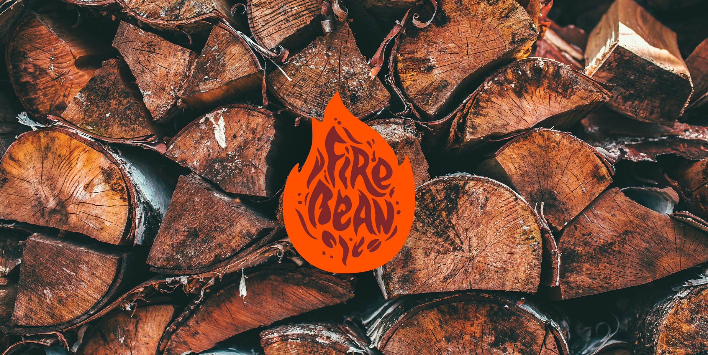
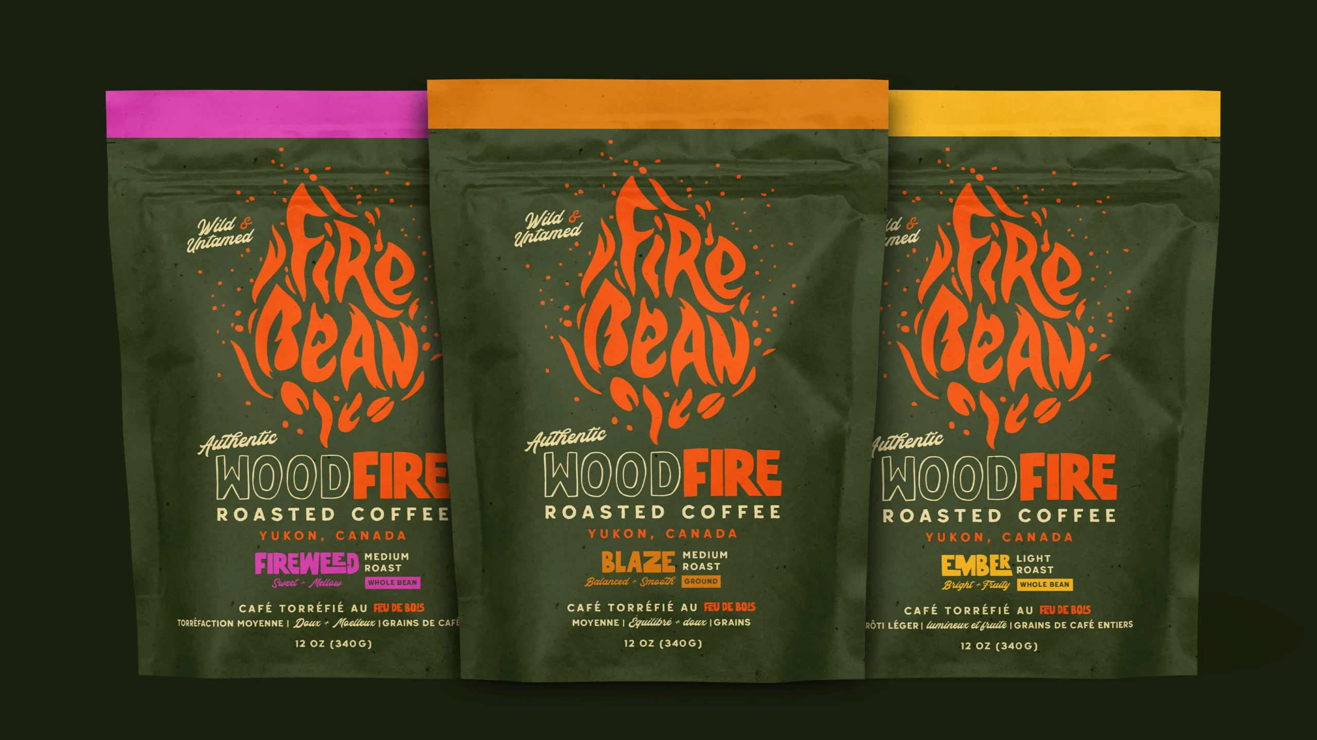
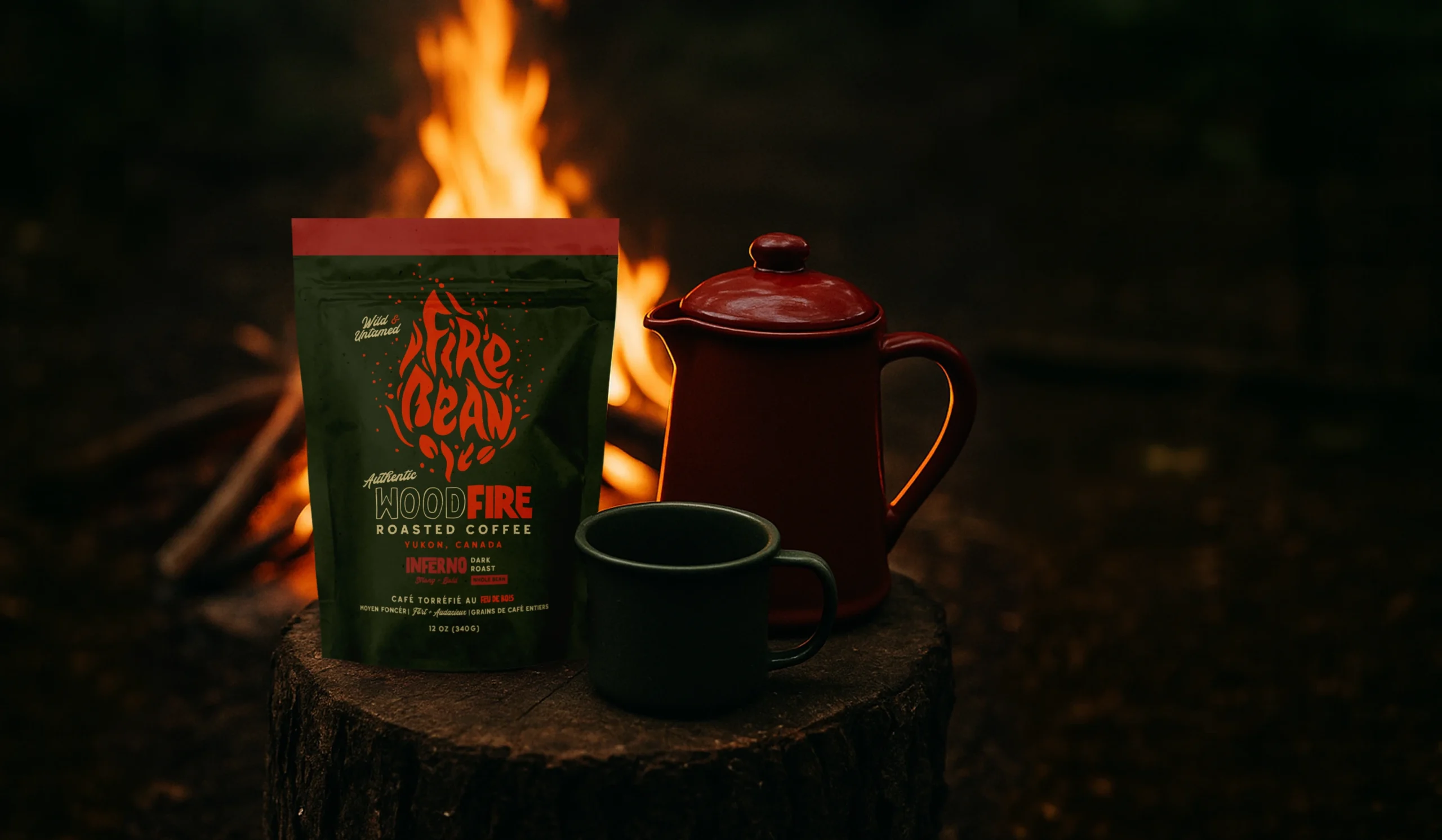
The rich, earthy colour palette with fiery orange accents captures the warmth of fire while evoking a rustic aesthetic. These tones bring the Firebean story to life; while names like “Starfire” and “Blaze” appear in typography visually echoing stacked wood.
Branding
With handcrafted typography, the brand design celebrates the harmony between fire and coffee beans, making it both unique and memorable.
Firebean stands out boldly in an industry dominated by conventional designs, ensuring instant recognition while vividly communicating the brand’s story.
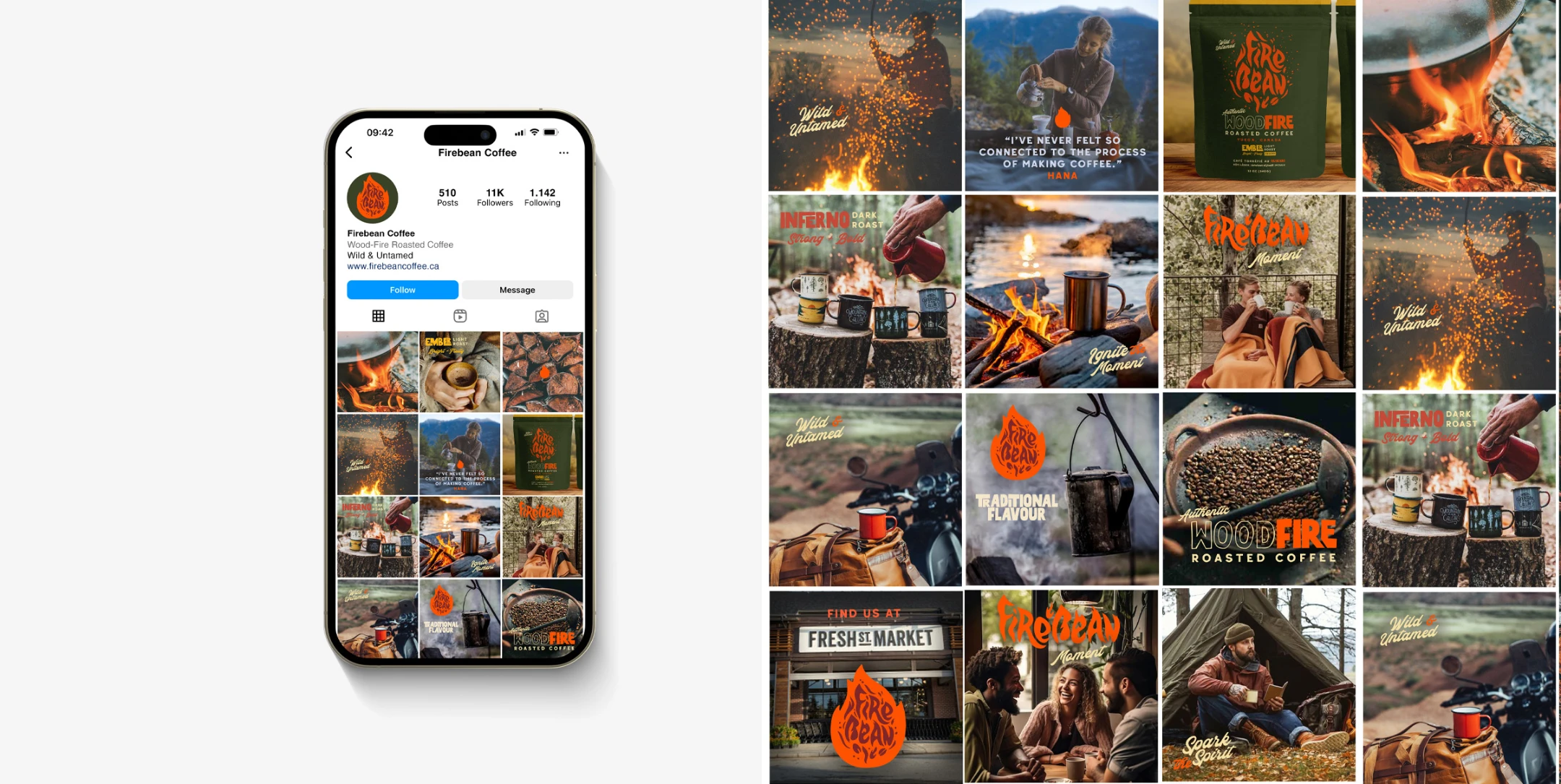
The design’s energy and passion resonate across various applications, delivering an unforgettable and untamed spirit of Firebean.
Key brand phrases such as Woodfire Roasted Coffee and Wild & Untamed are brought forward in expressive, organic typography that mirrors the rugged, handcrafted nature of the roastery. This language becomes an essential part of the brand identity, reinforcing Firebean’s roots in small-batch, woodfire roasting and giving the packaging a sense of place and authenticity. The result is recognition on shelf and deepened storytelling behind each blend.
The brand packaging system became a reflection of Firebean itself—small-batch craft, northern character, and the kind of honesty you taste in every roast. Each bag carries its own voice yet lives within a cohesive brand identity that feels simple, familiar, and true. The result is a quiet, enduring package design that supports their growth across blends, seasons, and retail shelves, while staying rooted in the spirit of a specialty coffee roaster who values craft over noise.

